{"content_id":"2113836","content_type":"product"}
Xếp hạng
4.00
5
2
4
3
2
1
Cá nhân hóa làn da tôiCá nhân hóa
làn da tôi
Vui lòng thiết lập loại da và vấn đề da của bạn trong mục MY.
Đánh giá
(2) li********Da thiếu nướcDa nhạy cảmDa mụnLàm sáng da / Đốm thâmBã nhờn / Mụn đầu đenLỗ chân lông toMẩn đỏTế bào da chếtĐược đề xuất20/08/2025 (UTC+0)
I grabbed two of these for just 10,000 won because they were close to expiration—what a steal! I'd been going back and forth about buying them since the product page didn't have enough swatches or reviews, but I decided to just go for it. Then I started to regret it because of the color payoff... but wow, what a surprise! At first touch, it feels like a powder blush, but the more you blend it, the more it transforms into this dough-like texture. It's such a unique formula. The case honestly looks like cheap plastic from a discount store, but it has everything you'd need and comes with a generous amount. There are pearls mixed in, and they're quite large particles. The color payoff is absolutely insane—the kind of intensity you rarely find from other brands. I applied it exactly as I normally would, and it came out almost exactly like the palette (though the Classic shade was slightly different). The color is incredibly rich and doesn't fade at all as you wear it—it stays bold the entire time. I was genuinely shocked. I kept thinking, "Are you really supposed to use this as a blush? It seems too intense even for eyeshadow, and I feel like I should be using it as a lip tint instead." That's the level of color payoff we're talking about. The product page showed it looking quite subtle, but the actual color is so much more vibrant and features shades that are hard to find from other brands. For those of us with bright undertones, this is like a lifeline. Honestly though, I'm not sure I can even pull this off myself—I'd say don't burden bright-toned skin with something this heavy. The pearls are bigger than expected, so they might scatter a bit when you apply them to your cheeks. The color payoff is way too intense for standalone use—absolutely not. If you only use it as an accent, you could make one pan last 10 years. I still have 10 months left on the expiration date, and I'm just laughing because I have no idea how I'm supposed to use this shade. And they really went overboard with the product page photos! Usually you expect the actual product to be slightly less pigmented than what's shown, right? But this arrived even more saturated than the photos. I'm not sure if I should call this false advertising or what. As for the Classic shade—it looks like a slightly darker rose color in the palette, but when I swatched it on my wrist, it came out as coral pink. What is this?  tj*****Da thiếu nướcDa nhạy cảmLàm sáng da / Đốm thâmQuầng thâm mắtMẩn đỏĐược đề xuất11/04/2025 (UTC+0)
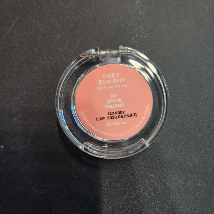
I've been using the Delight Color and I'm loving it! The strawberry milk pink shade is so pretty with those delicate shimmer particles. The formula feels soft and airy, making it super easy to apply by hand. The color isn't too bold and the payoff is beautifully subtle, which makes it perfect for adding just the right touch of color. If you have a deeper skin tone, the subtle color payoff might not show up as noticeably as you'd want it to.
